Friday, March 9, 2012

The Angels Need to Change Their Hats

I think it's time that the Anaheim Angels (I refuse to call them the L.A. Angels) change their boring cap insignia. Last year was the franchise's 50th anniversary and the team wore some great looking throwback jerseys and caps that look a whole lot better than their modern day set up. I suggest that the Angels make a permanent change and start to wear a hat that resembles this 80's era gem:

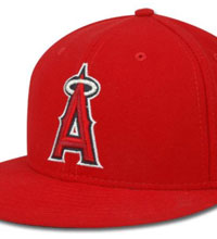
In my opinion, this is the best hat the team has worn in their 51 year history. They could update this style by perhaps keeping an all red hat, but put this lower case "a" on it in navy blue with a white outline. Even a more simple upper case "A" would be an improvement:

https://blogger.googleusercontent.com/img/b/R29vZ2xl/AVvXsEiVovTA11rXx1KuLrMugLTHMqbvSH7H3oFLRka9aep0honswb-OtuNMvvk8lsp2hkfp_z0F5F-NQil0BcvEkZEqL2qAX135kyRVLbqddTXRKsNXwYa20XXw_R5emTPR4Vy5yHtC_vACT7vY/s1600/angels70s1.jpg


They could also make their hats more visually stimulating by wearing something like this on the road:

http://www.strictlyfitteds.com/blog/2011/09/new-era-x-mlb%E3%80%8Ccalifornia-angles%E3%80%8D59fifty-fitted-baseball-cap/


I know that they are no longer called the "California Angels" and this would prob never happen, but I just love this Cali state outline with halo. I also suggest that their logo on the chest of their jerseys needs updating.

Tuesday, January 5, 2010

TCU Had Perhaps the Best Look in College Sports 2009

I have to interrupt the World Cup jerseys preview in order to show my appreciation for the new Nike 2009 TCU (Texas Christian University) football jerseys. After watching the Fiesta Bowl, I realized that the Horned Frogs (best team name and logo ever) have some of the hottest purple jerseys and silver helmets I have seen. Here's their complete 2009 look:

The jerseys are complete with horn designs on the shoulders and the team name written clearly above the numbers. I also like the black stripe down the sides of the shirt. But perhaps my favorite aspect of the look is the silver and black rough looking helmets. The only improvement would be to have just a horny frog on the helmet in place of the large TCU lettering. Or put a logo on there with both, like their other helmets. The ultimate alternate jerseys for this team would be all white with purple lettering. Boise State's uniform looked good too, I like how they have embraced the use of orange pants. Congrats to them on their second Fiesta Bowl win in four years. The win was complete with a classic Chris Petersen (their head coach) fake punt play and huge defensive moments.

Friday, January 1, 2010

2010 Word Cup Jerseys Preview

Now that the calendar has turned from 2009 to 2010, it's time to consider the changing styles in world football (meaning soccer) and the brand new jerseys that will be shown off to the globe during June's FIFFA World Cup. Soccer is one sport in which jersey details change from season to season. For example, this year Manchester United adopted a black V design on the front of their kits (shirts), Everton F.C. introduced a large white V shape around the collar which I love and had never seen before, and Fulham added black sleeves with white lines. International football is no different. Teams wear the same traditional national color combos but with changes in design details like stripes and other add-ons that emerge within the four year span between World Cups. Some of these additions are brilliant, while others are too much/complicated and hurt the simplistic aesthetic of good looking soccer jerseys.

Before I proceed to rate the new 2010 national team jerseys team by team, these first posts will focus on the jerseys of the African Nations playing in the World Cup, since 2010 will be the first time the competition will be held on the African Continent.

First up, the host Nation: South Africa. The home yellow jersey is respectably simple and follows the traditional color formula worn by the country's national rugby team, the Springboks. The away jersey is unique in that rather than having a solid green base, native designs and the Protea flower (which is a national symbol) are incorporated/faded into the interesting look. The green jersey resembles the vintage Mexico jersey, which was covered with an Aztec design. I'm a fan of both jerseys and I think the South Africans may surprise some people coming off their impressive showing in the Confederations Cup last summer. Look for Booth, Mokoena, and Everton star Pienaar to shine.

Wednesday, December 30, 2009

The Seattle Mariners Look Best in Teal Brim Hats


The 1990s style, teal color should be embraced by the Mariners organization during the next decade. I support the re-emergence of
the 90's navy blue hat with teal/ turquoise brim:

They could wear these at home, and keep the all navy hats for road games. I think this change back to the older style would be refreshing to see because there are too many all navy hats throughout the MLB (Boston, New York Yankees, Milwaukee, Atlanta, San Diego). If not the style above, another home alternate hat could look like this compass logo cap:

Tuesday, December 29, 2009

The Oakland A's Need To Bring Back Yellow Uniforms.


I think it's time for the Oakland Athletics to pay tribute to their team's history and start wearing yellow shirt jerseys as another alternate style. The team's first green and gold jerseys were worn way back in 1963 by the Kansas City A's and featured three different yellow shirt styles:

http://exhibits.baseballhalloffame.org/dressed_to_the_nines/detail_page.asp?fileName=al_1963_kansascity.gif&Entryid=1015

I'm in favor of rocking the yellow shirts, but I think that colored baseball pants are hideous. Thus, a yellow top with white plants would look stunning. The jersey set above was introduced as a major look change from the blue, white, and sometimes red worm by the Philadelphia A's and the original KC A's. The yellow jerseys I'm proposing for any upcoming Oakland season would resemble the alternate home jersey worn by the A's during the 1975 season:
I would love to see the Athletics wear the simple yellow top with green "A's" chest logo every Sunday home game in the modern era. I favor the sleeves instead of no sleeves style. The 1975 home white jersey is also a respectable style, and would make a good alternate someday. In general, I would like to see more chest logos incorporated on jerseys throughout the MLB, but I will get to the specifics of that later. If the retro style is too much, then a 1987- the present Athletics home jersey but in yellow instead of white would still make a unique alternate home jersey. For example, I have a fan jersey that is yellow and has the Athletics script in green with white trim.

I'm a fan of the current A's alternate black home jersey, but yellow would be much more distinguishable and historical. Generally, I love third jerseys in baseball and other sports, and I reckon the more styles worn, the better. The yellow jerseys could become popular again if the A's ownership gave them a chance for at least one season. Fans' reaction to yellow shirts could be gauged by sales of team apparel. Also, retro looks should be adopted by other Major Leagues teams as a form of celebrating the past and spurring fond feelings of nostalgia.